ITS FRAMEWORK
The ACTIA logo in its shape and colors has a meaning. This is why it is the subject of an international model registration and why it is fundamental to respect its integrity.
Only the logos presented in this charter may be used: shapes, colors and frames of use.
Only the logos presented in this charter may be used: shapes, colors and frames of use.
The sending of the logo to a legal or physical person outside the companies of the ACTIA group will be subject to a request addressed to the communication department.
UNDERSTANDING THE LOGO
ITS IDENTITY
The parallelogram and the bevelled form which declines it correspond to the dynamic interpretation of the components of an electronic chart.
These elements are an integral part of the logo and cannot be dissociated with some exceptions [ICONOGRAPHIC LOGO].
These elements are an integral part of the logo and cannot be dissociated with some exceptions [ICONOGRAPHIC LOGO].
Logo full colors
How to use it
The logo ACTIA in full colors has a very strong personality and enhances the ACTIA brand with its graphic codes. It is to be preferred in most cases and can only be used within a very strict framework:
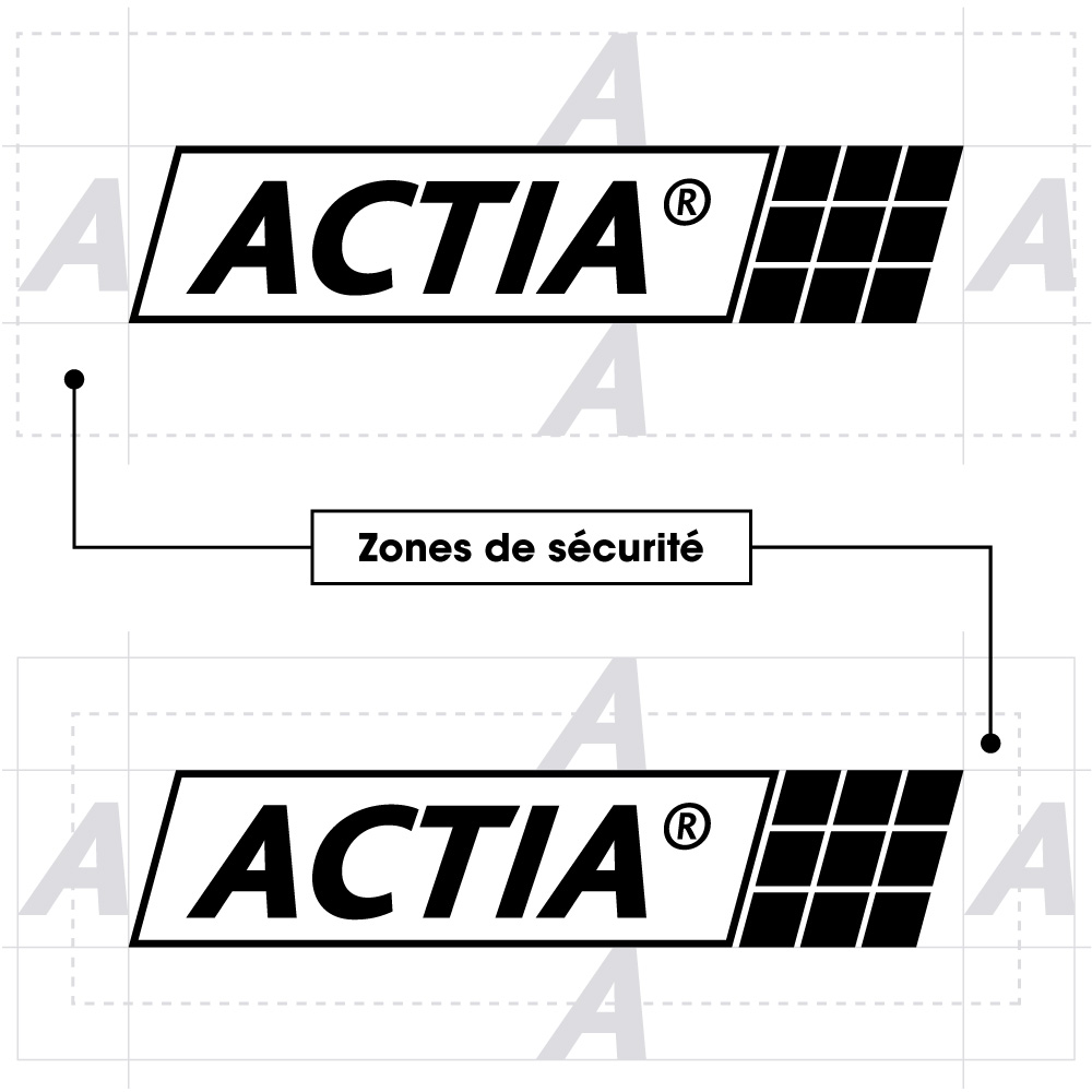
- Exclusively a white background on a pure composition.
- By respecting a minimum safety zone.
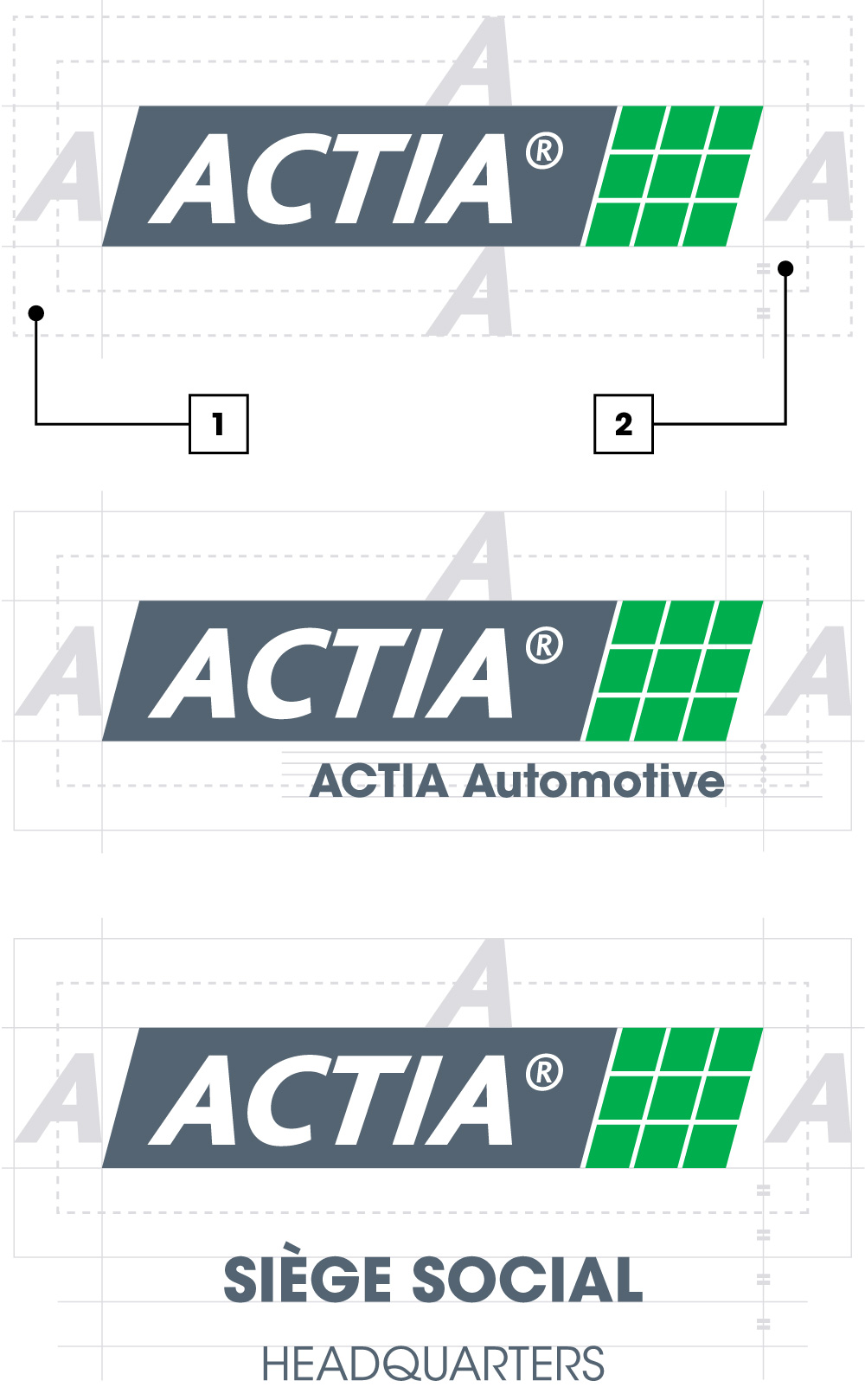
The logo can be placed freely while respecting the safety zone [1].
The minimum space is represented by the height and width of the letter [A] of the logo.
The minimum space is represented by the height and width of the letter [A] of the logo.
If the height / width of the safe area is restricted, the minimum space can be reduced to half [2] of the letter [A] of the logo.
This rule must nevertheless remain an exception in the imposition of the logo (example: high sign).
This rule must nevertheless remain an exception in the imposition of the logo (example: high sign).
If the corporate name was to be attached, it would be integrated under the logo, respecting the height, alignment, the typography (ITC Avant Garde Gothic Bold) and the color (Pantone 431C).
For the site entrance information, it would be integrated exclusively in the lower part of the protection zone [1], respecting the height, centering, the typography (ITC Avant Garde Gothic Bold/Book) and the color (Pantone 431C).
ITS COLORS
The logo is the very identity of the brand, that is to say the image it represents. It must be understood by all and easily memorized.
Like its shape, the colors convey a message marked by its identity.
Like its shape, the colors convey a message marked by its identity.
The green color refers to the PCB, while the gray color illustrates the industry and the rugged features of our products.
In an extrapolated way, the green color refers to “GO” and illustrates ACTIA’s entrepreneurial spirit and its independence in its willingness to move forward, while the gray color illustrates the durability of the brand and the group.
In an extrapolated way, the green color refers to “GO” and illustrates ACTIA’s entrepreneurial spirit and its independence in its willingness to move forward, while the gray color illustrates the durability of the brand and the group.
GREEN
Pantone 347C
C86 M0 J99 N0
R0 V174 B78
#00ae4e
GREY
Pantone 431C
C65 M48 J41 N20
R84 V100 B114
#546472
The Wired logo
How to use it
The [WIRED] logo keeps the same shape as the logo in full colors and will be used in rich graphic environments (colors, photos, product marking…) in which the color logo cannot be expressed and respecting the security zone previously defined.
Only the ACTIA brand must appear on the products in its logotype expression and according to the frameworks of use of the logo explained above.
The corporate names of companies in the ACTIA group do not appear on ACTIA products.
Only the ACTIA brand must appear on the products in its logotype expression and according to the frameworks of use of the logo explained above.
The corporate names of companies in the ACTIA group do not appear on ACTIA products.
- On solid color, the white [WIRED] logo [NEGATIVE] is mandatory positioned on one of the colors of the chromatic palette in the limit of its visibility.
- On a photo, the white [NEGATIVE] [WIRED] logo must be positioned on a dark area.
- On Black & White prints and materials, the [WIRED] black [POSITIVE] logo is positioned exclusively on a white background.
- On solid color, the [WIRED] black [POSITIVE] logo is mandatory positioned on one of the colors of the chromatic palette in the limit of its visibility.
- On a photo, the black [POSITIVE] [WIRED] logo must be positioned on a light area.
The Iconographic logo
ITS IDENTITY
The parallelogram which depicts the ACTIA logo corresponds to the dynamic interpretation of the components of an electronic card.
It is its abstract representation and conveys the values of the company in a single image.
It symbolically expresses what ACTIA offers as services and as products.
It is its abstract representation and conveys the values of the company in a single image.
It symbolically expresses what ACTIA offers as services and as products.
How to use it
Its field of application must remain symbolic and complementary (second reading) to the ACTIA logo: iconographed footer, wall graphic signs), limited product marking area, web “Favicon”.
Its framework for use in original compositions must be submitted for validation by the communication department.
Its framework for use in original compositions must be submitted for validation by the communication department.
[Favicon] Website
Markets / Solutions
Markets / Solutions
[Favicon] Website
Markets / Solutions
Markets / Solutions
[Favicon] Website
Corporate / Local
Corporate / Local

Table of LOGO USES
a
request
Question
?