The ACTIA ★ brand logo has a very strong personality and highlights the soul of ACTIA. It is essential to respect its integrity in terms of form, colours and graphic codes. A white background is preferred, but it can also be used on photos with a light background within the limits of its legibility and contrast. The ACTIA logo has been registered as an international model.
Follow proper clear space to ensure the ACTIA logo is legible and clearly represented across all use cases.
The free space around the logo is determined by the size of the « A » in the logo.
No other element may be positioned in the free space.
These guides also indicate the space required up to the edge of the frame or page.
Use the brand logo on light background within the limits of its legibility and contrast.
Prefer to use a white background.
Do's and Don'ts
It is important to ensure that we use the logo in its integrity and that the appearance of the logo remains consistent. The logo should not be misinterpreted, modified, or added to. Its orientation, color, and composition should remain as indicated in this document – there are no exceptions.
The one colour logo is for use cases on ACTIA products and goodies in which the brand logo cannot be expressed (technical or costs constraint). The one colour logo only be used for product branding to minimise printing costs. The ★ brand logo will still be preferred in most cases of use.
Clearspace
Like the ★ brand logo, respect proper clear space and the security zone within the limits of its legibility and contrast.
The free space around the one colour logo is determined by the size of the « A » in the logo.
No other element may be positioned in the free space.
These guides also indicate the space required up to the edge of the frame or page.
Iconographic logo
Our icon is a shorter version of our ★ brand logo.
The ACTIA iconographic logo may only be used when the ACTIA brand is clearly visible or has been well established elsewhere. Its field of application must remain symbolic and complementary to the ACTIA ★ brand logo. The ACTIA iconographic logo may be used on backgrounds and images within the limits of its legibility and contrast.
Like the ★ brand logo, respect proper clear space and the security zone within the limits of its legibility and contrast.
The free space around the iconographic logo is determined by the size of the « square » in the iconographic logo.
No other element may be positioned in the free space.
These guides also indicate the space required up to the edge of the frame or page.
Core colors
ACTIA green is the main colour of our brand and must be the main colour of all ACTIA brand content.
- Core & brand colors -
We use ACTIA’s iconic green colour, as well as black and white, to produce the majority of the brand’s communications (PRINT & WEB). These colours ensure consistency and brand awareness with our audience.
ACTIA Green (logo)
– Pantone 347C –
C86 M0 J99 N0
R0 V174 B78
#00ae4e
ACTIA Black
C69 M60 J56 N66
R51 V51 B51
#333333
White
C0 M0 J0 N0
R255 V255 B255
#ffffff
- Color ranges -
The complementary palettes extend the main palettes. Their use will remain incidental and will in no case replace the dominant and principal colors constituting the overall and graphic entity of ACTIA.
Green main pallet
ACTIA green (logo)
– Pantone 347C –
C86 M0 J99 N0
R0 V174 B78
#00ae4e
C75 M0 J99 N0
R57 V181 B75
#39b54b
C64 M0 J99 N0
R101 V188 B71
#65bc47
C53 M0 J99 N0
R133 V196 B66
#85c442
C42 M0 J99 N0
R161 V205 B60
#a1cd3c
C30 M0 J99 N0
R189 V210 B72
#bdd248
Grey main pallet
ACTIA grey (logo)
– Pantone 431C –
C65 M48 J41 N20
R84 V100 B114
#546472
C52 M38 J33 N16
R116 V126 B135
#747e87
C39 M29 J25 N12
R144 V150 B157
#90969d
C26 M19 J16 N8
R175 V179 B185
#afb3b9
C13 M10 J8 N4
R209 V210 B213
#d1d2d5
C5 M1 J2 N0
R237 V244 B245
#edf4f5
Blue complementary pallet
C100 M85 J51 N71
R0 V13 B39
#000d27
C93 M68 J42 N57
R5 V45 B65
#052d41
C86 M51 J33 N43
R22 V73 B95
#16495f
C79 M34 J24 N29
R35 V107 B131
#236b83
C72 M17 J15 N15
R45 V145 B174
#2d91ae
C65 M0 J4 N0
R43 V195 B234
#2bc3ea
Orange complementary pallet
C22 M96 J82 N16
R172 V36 B42
#ac242a
C9 M90 J82 N1
R215 V52 B48
#d73430
C0 M85 J81 N0
R239 V64 B48
#ef4030
C0 M76 J84 N0
R241 V88 B45
#f1582d
C0 M67 J85 N0
R243 V111 B43
#f36f2b
C0 M52 J95 N0
R247 V144 B40
#f79027
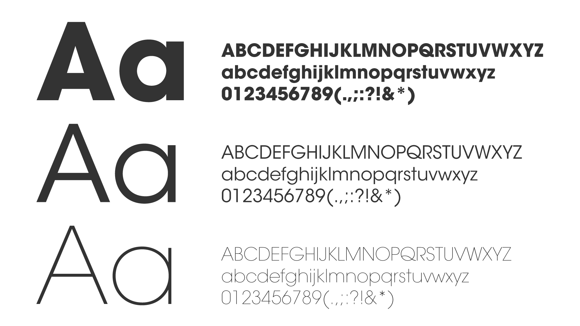
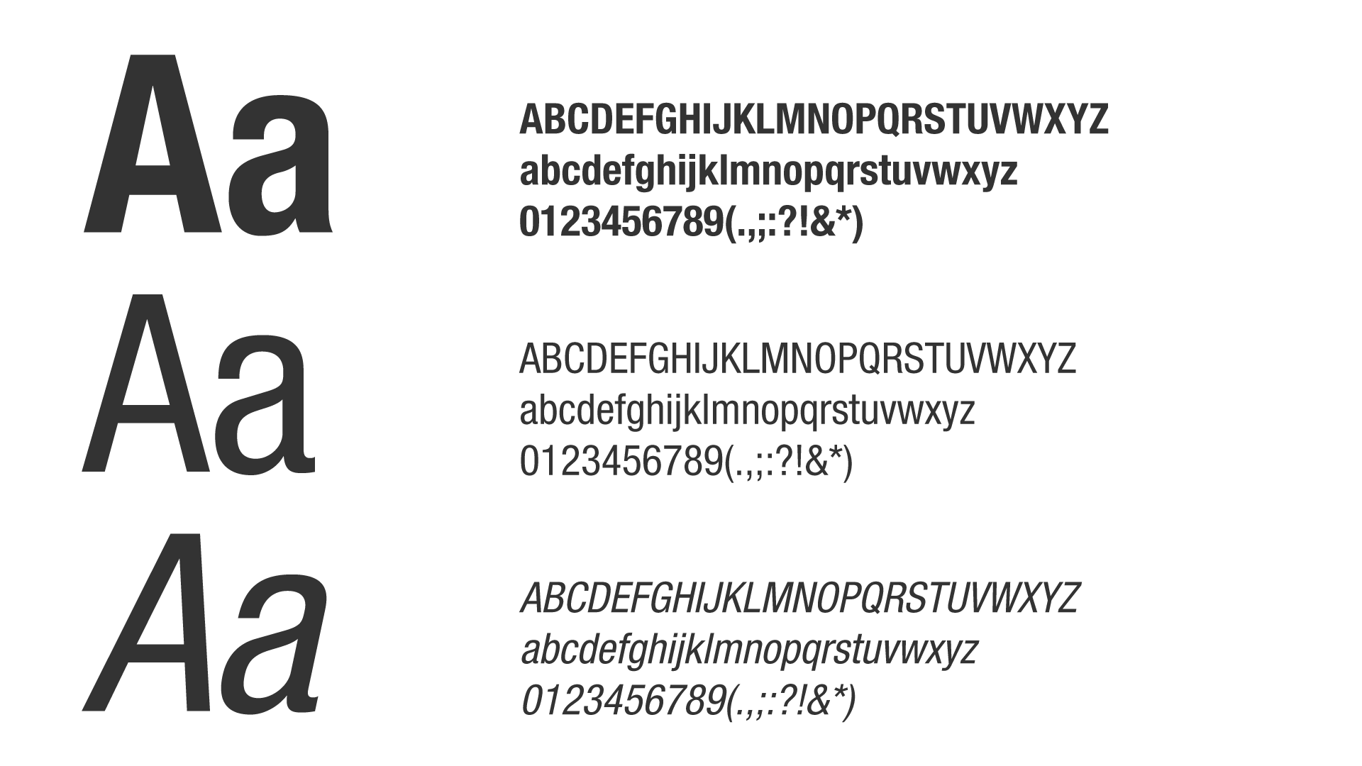
Typography
Like the color palette, the font helps establish and identify ACTIA and define its brand identity.
- Title -
We use ITC Avant Garde Gothic as our primary typeface throughout our brand, including for headlines in marketing and products. Century Gothic is used as a replacement font for ITC Avant garde Gothic. Free to use and available by default with the office suite.
Helvetica [Neue] is our expressive typeface that is used as the brand’s formatting texts font. Arial [Narrow] is used as a replacement font for Helvetica [Neue]. Free to use and available by default with the office suite.
Yes, the ★ brand logo is ACTIA's true identity and the one colour logo is reserved for product branding.
No, the safety zone or clearspace around the logo must always be empty because the ★ brand logo alone is preferable. If the company name is to be included, it must be submitted to the communications department for approval.
No, the iconographic logo is a shorter version of our ★ brand logo with his iconic green colour.